Let's Make a Map! pt 1
A case study of roguelike map design
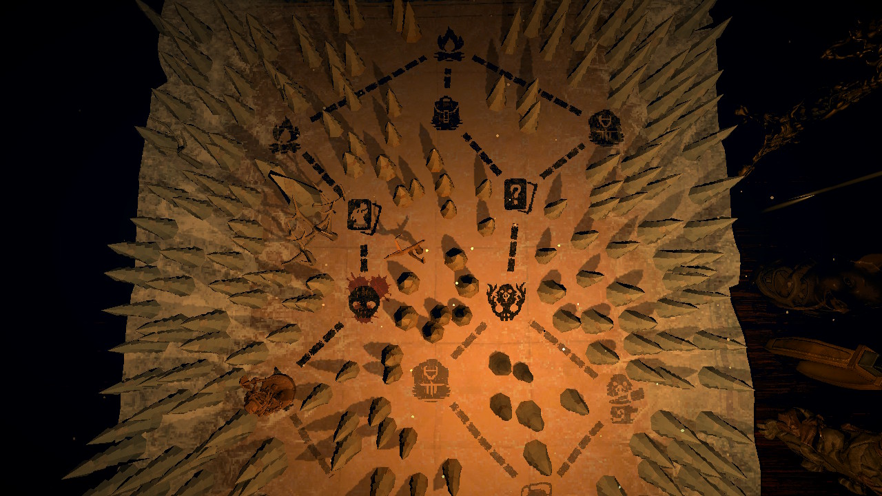
If you've played an indie game recently, there's a good chance you've seen something like this: a scattering of little symbols, all strung along dotted lines that repeatedly branch apart and merge back again; each fork in the road begging the question, "Which path will you choose?"
This is the map screen! A humble bit of interface that has become fairly ubiquitous in the roguelike genre. It unobtrusively hurries our player character along a series of encounters—typically making up the meatier core gameplay—while still lending us a sense of agency and adventure. Many paths lie before us, each with their own sense of risk and reward, and it is up to us to choose which we will take!
So today, let us meander through the meadows of merry map-making and mayhaps muster the means to master it ourselves! If we succeed, we can use what we learn here to design and implement map systems for our own games in a future article. Personally, I'm interested in making a roguelike deckbuilding game, so those will be the source of most of my case studies. Feel free to extend this same process to your favorite games as well! So without further ado, let's begin...
Slay the Spire
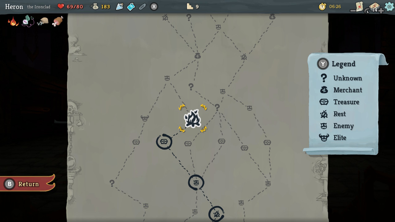
While Slay the Spire may not be the first roguelike deckbuilding game—with the earliest entries in the genre coming 4 years prior—it is often the first one that springs to mind. Releasing in early access back in 2017, it has had a clear and undeniable influence on the many deckbuilders that have come after it. In many ways, it has served as the template for the genre, and its map system is no exception.
What works
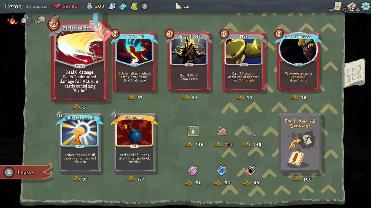
Slay the Spire stands out in the number and complexity of decisions it asks you to make. Not only are chapter maps filled with dozens of events, spread out across several distinct paths, but each encounter is itself a nested matryoshka full of new choices. A single random event will sometimes offer 3 or 4 options with unique costs and benefits. Bonfires ask you to choose between replenishing health or upgrading a card. Shops will each offer you 7 cards, 3 relics, 3 potions, and the option to remove a card from your deck. There are special relics that augment the choices at many of these encounters as well! This all comes together to weave a rich tapestry of strategic decisions, each of which can change dynamically based on the results of the last. This complexity provides us with a lot of variation and, in turn, that signature roguelike™ sense of discovery across runs!
Unlike other games in the genre, Spire's map system also presents a huge amount of variation in the number of combat encounters per chapter. Many deck builders will dole out a specific number of fights per map, or only make a couple of them optional. But there are extreme cases in Spire where you can cross most of a chapter without a single combat. Or you may have a strong start and decide to fight 4 elites in the first area instead. These moments make Spire's gameplay feel rich and dynamic! In this way, I believe the map system is at the heart of why this game stands out as one of the most deeply strategic and replayable of the genre. The sense of mastery you get from planning out your route, pushing your luck just enough, and finishing a chapter with a sliver of health left is a lovely reward for mastering a system which starts out quite intimidating!
What doesn't
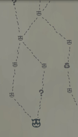
So one of the great parts of Spire is that you are presented with so many interesting options! Unfortunately, the map screen does little in the way of aiding these decisions. Each encounter is represented by a small symbol, none of which are distinct in either size or color. This means the player has to visually comb through each path—of which there are many—just to parse out its key destinations and hazards. It is also worth noting this is the only of the maps we will look at today that feels the need to add a legend, which feels like of a bit of a design smell coming from this readability problem.

The next one is a bit of a nitpick, but I like a map that gives me a sense of the place I'm traversing. In this regard, Slay the Spire does offer some architectural doodles on the side of the parchment, but this is not enough! Even after playing countless hours of this game, I have little idea of what the spire is or looks like. If the map was styled to look more like a series of floors, or there was a full background on the map representing the part of the spire the player explores in each chapter, I feel that would go a long way in giving character to the game's titular structure.
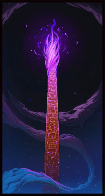
Compounding this is the lack of movement between encounters. When combat ends, you cut directly to the map screen. For a game all about climbing up, up, up, a simple rising animation between floors could have lended a nice sense of traversal and ascent. This is less of a problem and more of a missed opportunity. Still, I bring it up because I think Slay the Spire succeeds in creating a really unique world and I only wish I got to see more of it!
Cobalt Core
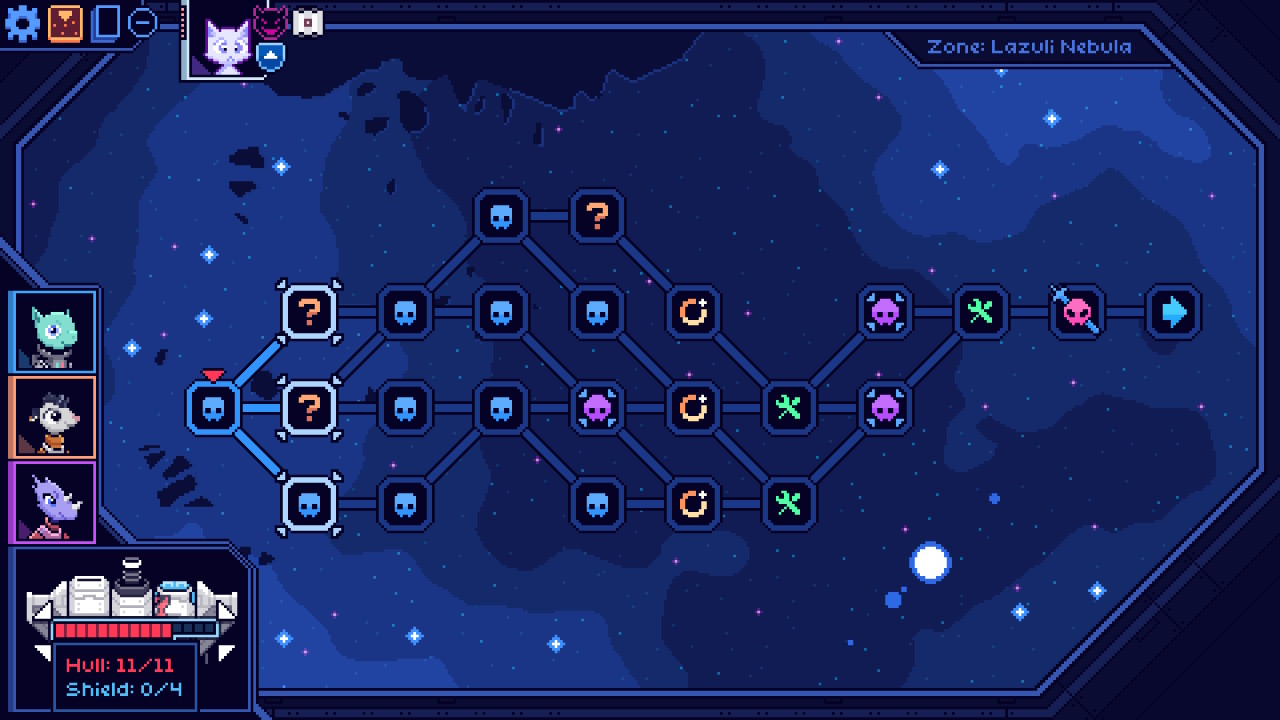
This stylish sci-fi deckbuilder has you assembling a crew of 3 crittery cosmonauts—each with their own set of cards and mechanics—in order to pilot your ship through a dangerous galaxy. A single run then represents a time-loop in the games' narrative, which slowly unravels itself with each successive win. Being a more recent entry in the genre, it has done a lot to polish and simplify systems of the games that came before it. Perhaps one of the clearest examples of this is the game's map.
What works
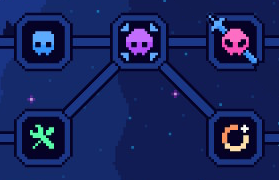
One of the first details you'll probably notice are the vibrant color-coded icons! They make the general structure of each map much more readable and clear. Even more, you can tell the colors were thoughtfully chosen: combat nodes become redder as their relative danger increases, with cool-blue enemies, warm-purple elites, and red-hot bosses. A bright yellow alerts you to powerful relic nodes; and it's easy to tell repair nodes are for healing due to their juicy hue of green! All of these colors really pop due to that beautiful backdrop of cosmic blues as well—which reminds me!
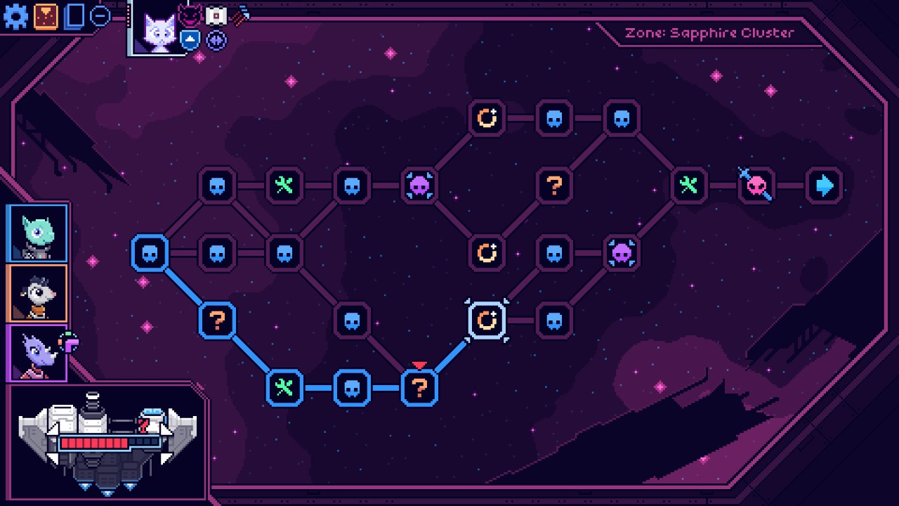
That lovely cosmic background tells us what area we are in. It changes its features and colors as you progress between each sector, giving us a nice sense of place—and a sense of space too! :) The third zone excels at this further by showcasing a collapsing star, both providing an iconic key landmark for our journey and reinforcing it as something that exists beyond a single combat screen. Meanwhile the derelict scrapyard you see upon reaching zone two offers us context for the dangerous outlaws and cunning scrappers found there. If we listen closely, we can hear Cobalt Core telling us that it's not just a background image, it's the setting of our whole adventure!
What doesn't
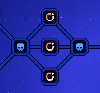
Though I really like the choices Cobalt Core has made in order to simplify its map system, they seem to have come with some side effects. Namely, you run into a lot of non-decisions; you'll be presented with a fork in the road, but all paths will offer an identical choice. Technically this can occur in other deckbuilders too, but in the case of Cobalt Core it is both more frequent and more noticeable. More frequent because paths can merge immediately after branching; and more noticeable because maps are shorter and more dense. Thankfully this is a solvable problem! When generating a zone map, a second pass could check for redundancies and trim them out. Or these strategic imposters could be swapped out with nodes of a different type in order to offer us something more worth considering.
Inscryption
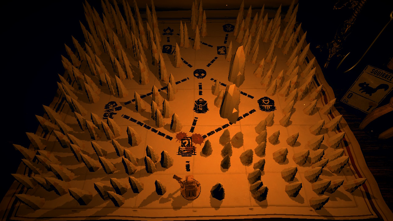
There's a lot that could be said about the surreal and surprising Inscryption, but to tell too much would risk spoiling a very special experience. What you must know is this: in a dark cabin, you sit across the table from a shadowy figure, playing a high-stakes game of cards where sacrifices must be made.
What works
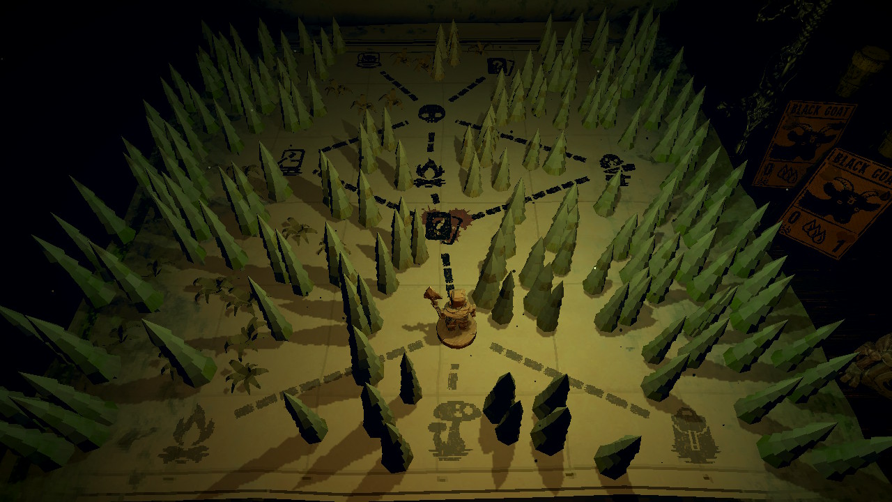
Though Inscryption's gameplay takes the structure of a traditional deckbuilding roguelike, it is unique in its framing. You aren't climbing a dangerous tower or fighting your way through a hostile star system, you are literally playing cards at a table. So when I discuss this game's map system, it should be noted that it is genuinely a paper map that is unfolded before you. Not only does this do a lovely job of reinforcing the game's setting, it pulls a clever trick of dimly lighting the table so we can only see a few decisions ahead. I find this very effective in both selling the dark, ominous atmosphere of the game and preventing the player from over thinking their next move. Instead of succumbing to analysis paralysis, the player is propelled through the darkness of the woods, unsure what may lie in the shadows ahead.
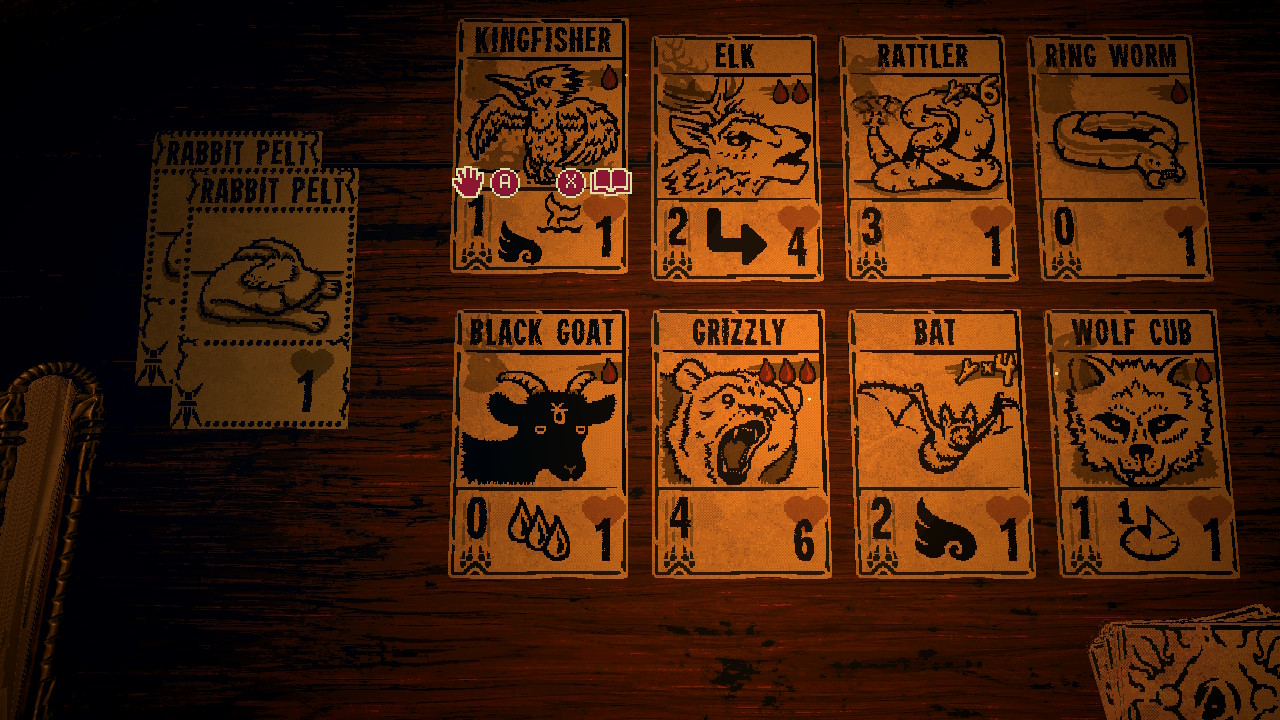
There's a neat bit of encounter design that I admire here too. As you travel through snowy forests and humid wetlands, you have a chance of running into the Trapper. The Trapper offers you their pelts in exchange for any teeth you have acquired (don't ask), but those pelts will take up a spot in your deck. So why take these pelts at all? Because further along, you can meet the Trader! The Trader will then offer you a choice of several different cards in exchange for each pelt you've brought this far; if you brought an expensive golden pelt, you can even choose from some of the most powerful cards in the game! This "lock-and-key" design is so effective in allowing the player to push their luck—by taking on a burden now in hopes of a pay-off later—I'm surprised it hasn't become a staple of the genre.
Dicey Dungeons
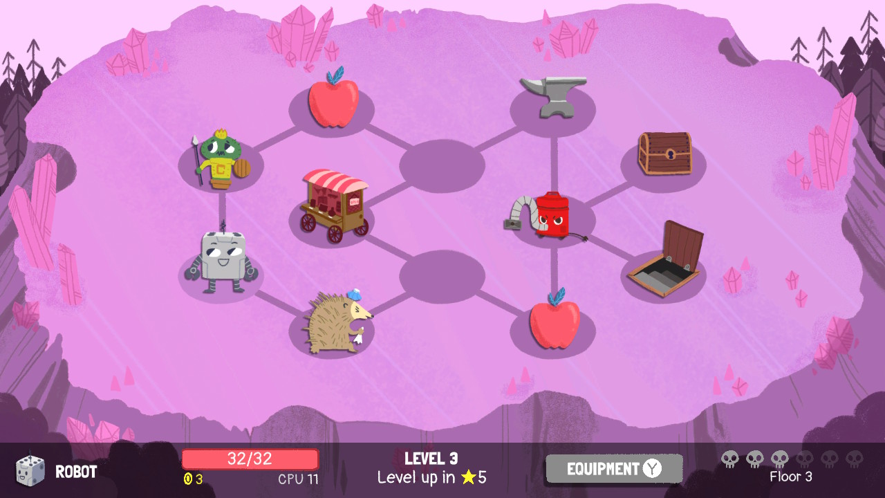
Trapped in a twisted game show and transformed into dice for others' entertainment, Dicey Dungeons has you battling through a series of bizarre challenges—each with their own set of game-changing rules and restrictions. Yes it's a dark premise, but look at what a charming art style it has! While not exactly a roguelike, Dicey Dungeons boasts a unique take on the formula that warrants a closer look.
What works
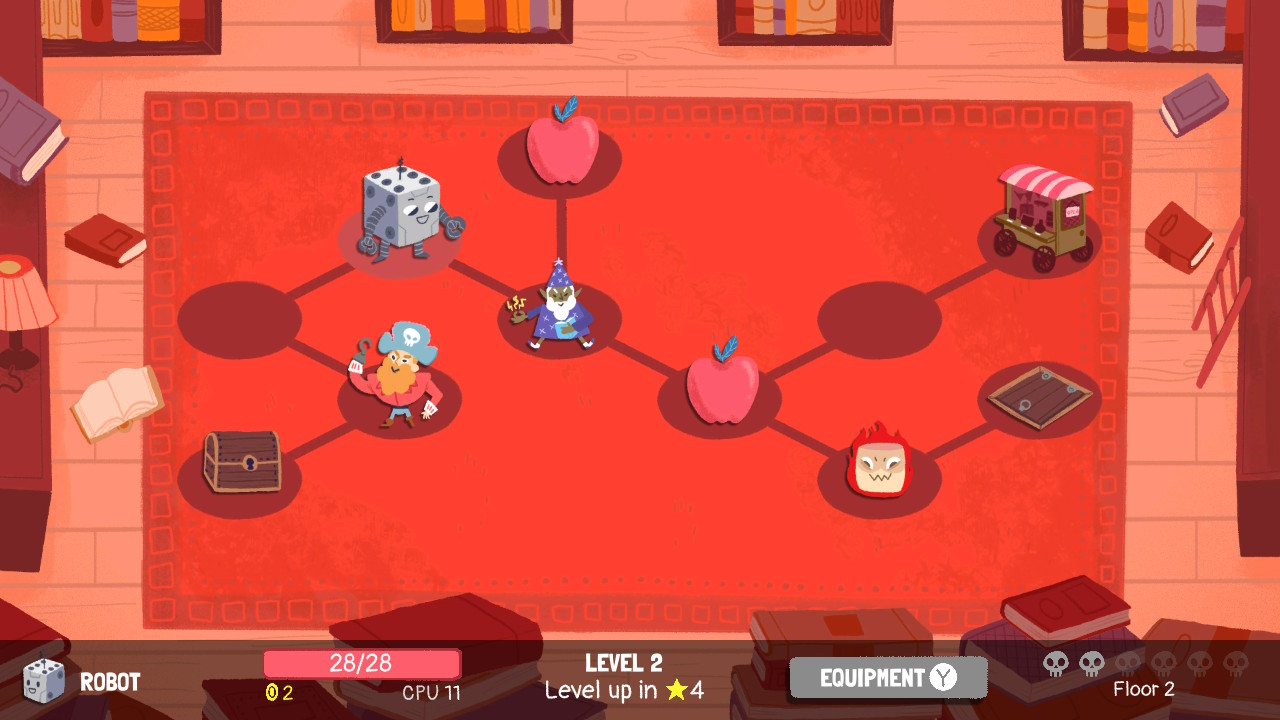
Unlike every other map we've looked at thus far, Dicey Dungeons lets the player navigate freely through a given floor's nodes. Treasures and exits may be blocked by enemies, but it is up to you in what order you take them on and whether certain rewards are worth the risks at all. The fact you can explore the whole floor means you must balance the temptation to collect everything with the reality of your limited health pool. It's a different mode of decision-making that more closely resembles a game like Binding of Isaac or Enter the Gungeon. This plays nicely with the game's leveling system where gaining experience from enemies fully heals your character and gives them small stat boosts; proper planning means you can time this free heal for maximum effect, topping up right before a troublesome enemy or boss!
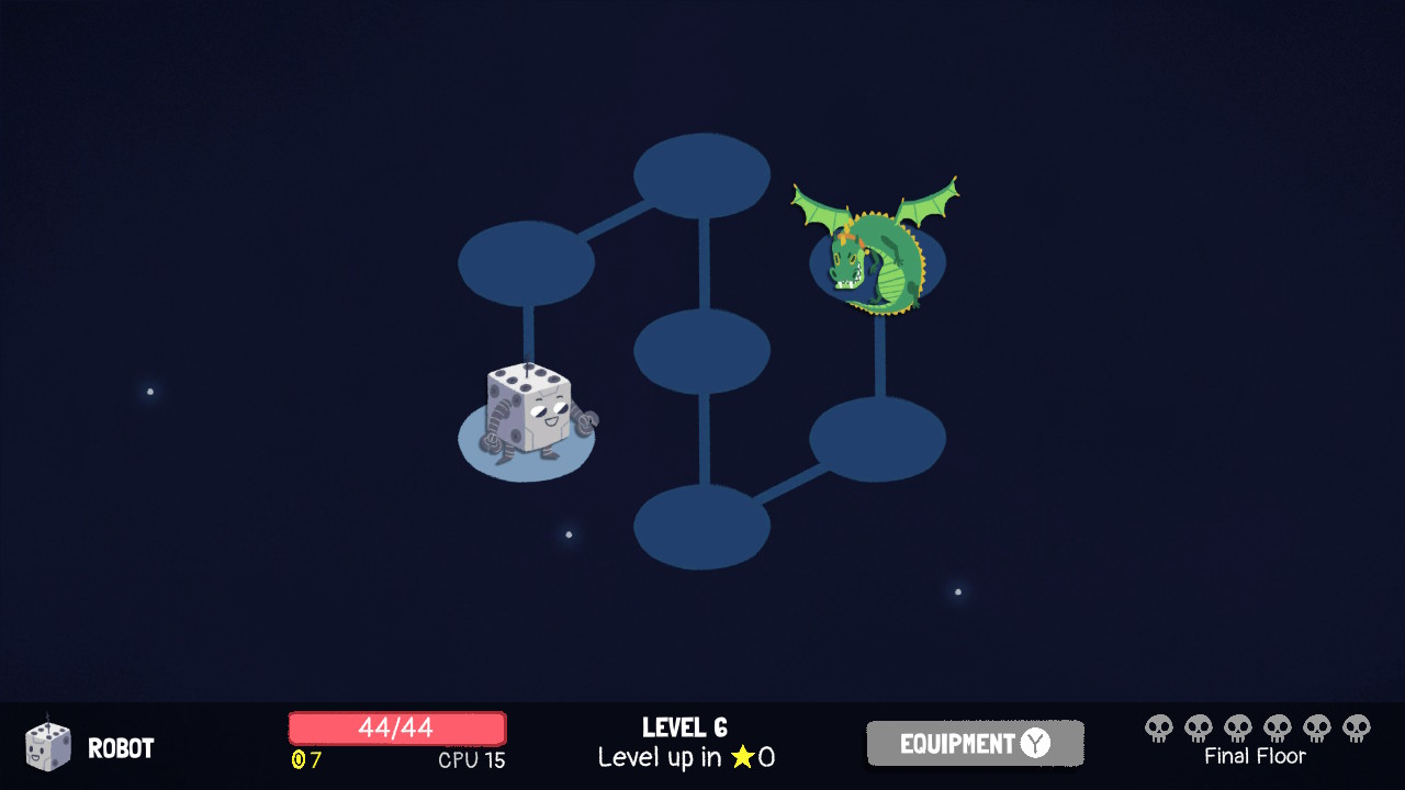
Speaking of which, each boss zone in Dicey Dungeons has a neat visual trick up its sleeve! Instead of map nodes being functional, with each hosting an enemy or treasure, they serve to draw a decorative pattern. One might argue this has no gameplay significance... they would be wrong! Is it not obvious how this builds suspense before your final fight? Does one not appreciate the way it emulates the style and flair of a villain's evil lair? Surely no one could be so desensitized as to not delight in this delicious detail of dramatic decorum!
Hades
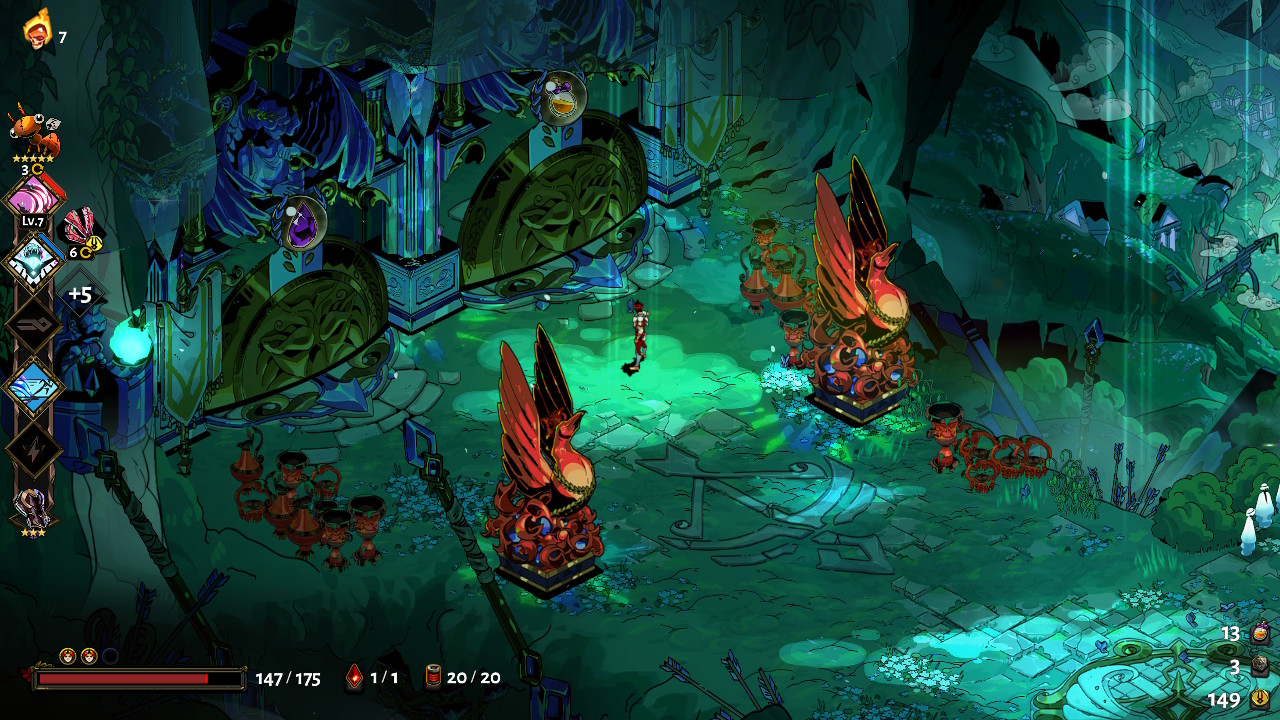
No, Hades is not a deckbuilder; it is an action roguelike with a unique emphasis on engaging characters and rich storytelling. In fact, Hades eschews the sprawling map screen entirely! In its stead is a simple choice presented after each chamber, "Which room next?" For an action game, this smartly shifts the focus from long-term route planning (slow, no punching) to near-immediate gratification (fast, more punching). While these choices still reward strategy, they also de-emphasize it; something a deckbuilder likely wants to avoid. So why do I bring it up here?
What works
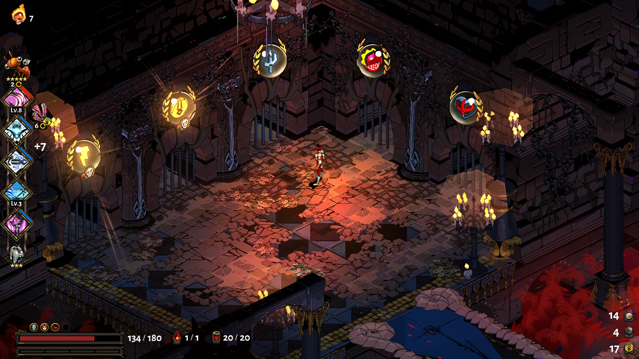
Because Hades does something I haven't seen in any other roguelike before: it changes its structure in the game's final area. Instead of moving linearly through a set of rooms to reach a boss at the end, you are trapped behind a locked door in need of a key to progress. In order to find that key, you need to venture into one of five mini-dungeons. Though you are told what reward lies at the end of each, only one will contain your ticket to the final boss—and some healing to boot!
I absolutely love the shift in decision-making this presents us! Where before we had to choose one option from two or three, now we have to establish a priority amongst five. Maybe you start with the most dangerous dungeons that offer the greatest rewards; they will help you the most after all! But, if the key eludes you, doing so could leave you too low on health to explore the other paths. And in the case that you've already found the key and been topped up before the boss, risking that health to keep exploring could be what you need to really push your build over-the-top!
Conclusion
Going into this, I thought I had a clear picture of what I wanted to say about each game and what conclusions I wanted to draw from them; but in the process of writing this all out and taking on a more critical eye, I began to notice different details that lead me to ideas I hadn't considered before. This is the first article like this I've written and I wasn't really sure if anything would come from it, so I'm happy to have come away with some exciting inspiration for my game's own map system. I hope it was insightful, or at least entertaining, for you too!
In part 2, I'm planning to document the development process of making that map system, sourcing its inspirations from the games mentioned here. It's an experiment, but I like the idea of trying to connect the dots through that process! So let's see how it goes.
Thank you so much for reading! <3
- Gabriel